Here is my blog containing our typeface development for our movie opening project. This blog
and work is done by Cassie.
A typeface is the design of letters, numbers, and symbols that create a specific visual style
for text. It helps shape the way words look, making them feel formal, casual, modern, or
even eerie. For our project, choosing the right typeface is important because it helps set the
tone of the story. By carefully selecting a typeface, we can make sure our project matches
the emotions we want to create. But first, we must know what our title is before we can create
the typeface.
Picking the right title for our project wasn’t easy. We wanted something that matched the story
and stuck in people’s minds. After a lot of thinking, we narrowed it down to four choices:
Missed Call
Text Me When You Get Home
Invite Only
Afterparty
Each one had a good reason to be picked. Text Me When You Get Home felt familiar, something
people actually say. Invite Only made the story feel exclusive and secret. Afterparty hinted at
something happening after an event, maybe something unexpected or dark.
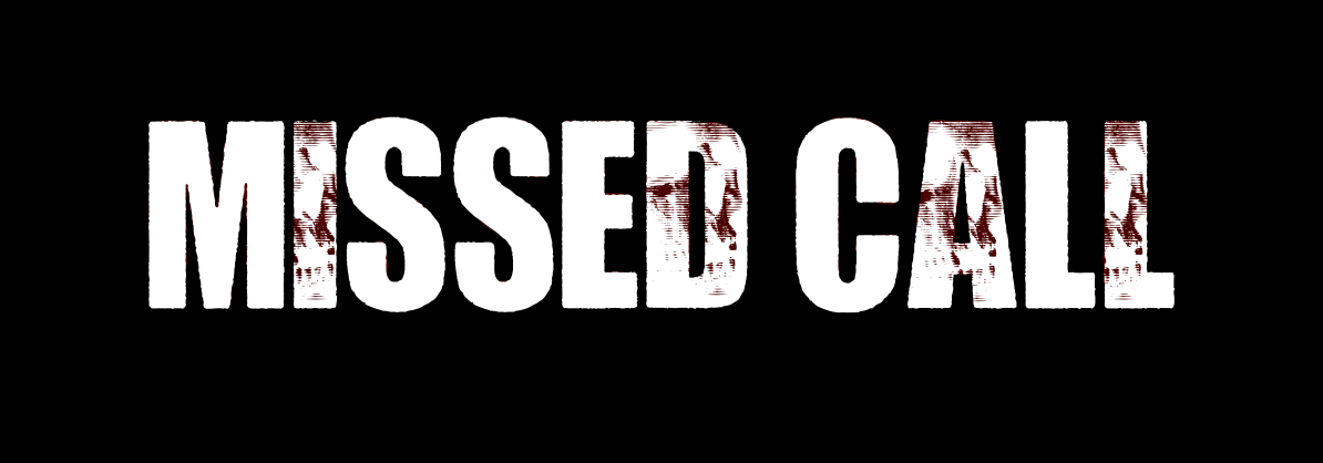
But in the end, Missed Call was what we went with. The title is simple but powerful. In our story,
that one missed call is the turning point. In our story, a mother calls her kidnapped daughter, but
the daughter doesn’t answer. That missed call is more than just a phone notification, but rather a
symbol that shows the loss of communication. It creates suspense and makes people wonder: How
will the mother contact her daughter again?
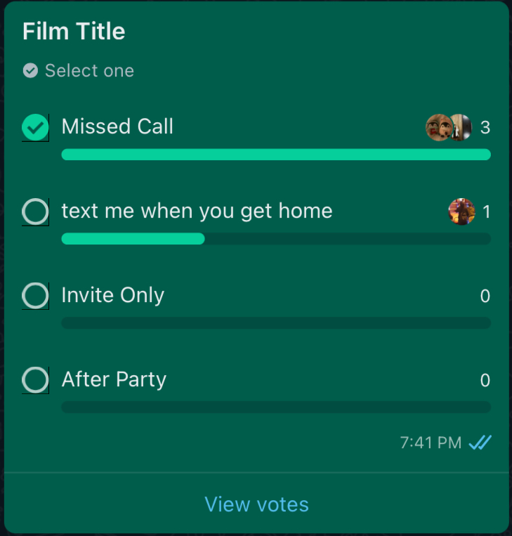
Our group members decided this title by holding a poll in our group chat, where we discussed
each title and came to the final conclusion of Missed Call.
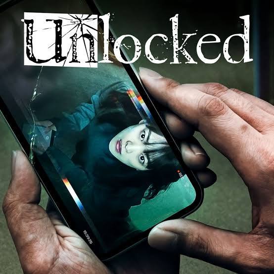
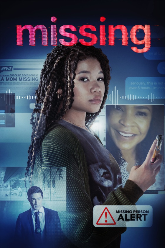
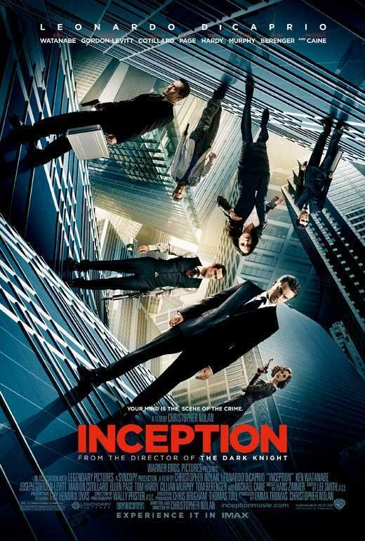
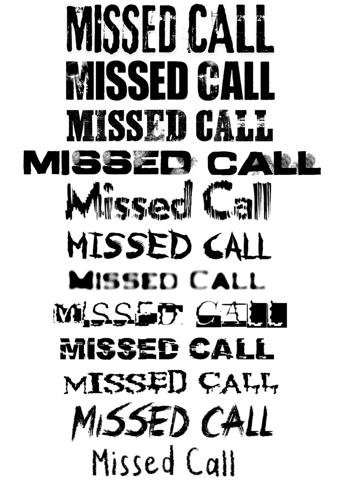
Before choosing a font for our title, I looked at other thriller movies to see what kinds of
typefaces they use. Above are some movie posters of a few thriller films that have typefaces I
like and I’d like to experiment with. Thriller movies have their own unique typefaces, and I
have classified these into these categories:
Distorted or Glitched – Text looks glitchy or broken, which can make the audience feel
like something is wrong or out of place. It also implies corrupted signals or lost
communication.Sharp and Jagged Edges – Suggests violence and creates a sense of unease.
This has a horror-like texture and messy look that suggests something dangerous
is happening, and adds mystery.Bold, Heavy Lettering – The thick and strong letters make the title stand out and
feel intense. This makes the title more impactful when shown, and adds a sense
of tension, grabbing attention right away.Minimalist, Sans-serif Fonts – Creates a sleek and clinical aesthetic, often used in
psychological thrillers.
Handwritten or Scratchy Styles – Feels unsettling and personal, like something
written in fear, or written by a criminal. Usually used in horror-thrillers.
Red Accents or Fading Effects – Implies blood, danger, or an ominous presence.
My two favorite fonts are the glitched font and bold heavy lettering.
I also thought about what names and credits to include. The text needs to be clear but still
match the thriller style. It’s important that the audience can read the names of the people
involved in the film while still feeling the suspense and mystery.
Here are the fonts we’ve considered:
And since we plan to show the title in a dark background, I made this:
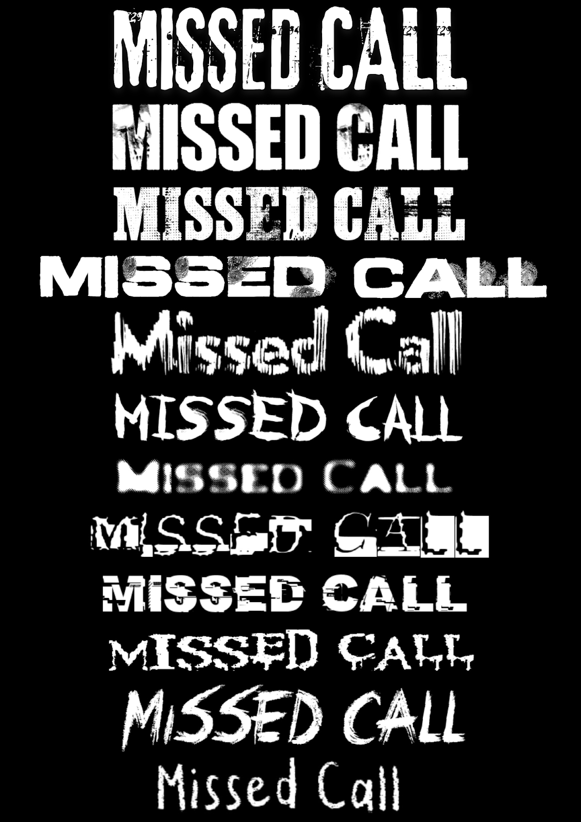
After careful consideration and group polls, we narrowed it down to the 2nd and 8th font, which
falls under the glitched text and bold heavy lettering fonts.
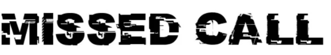
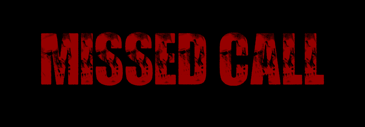
This font has a glitch effect, which gives it a digital feel and shows that something is interfering.
This might work well for our thriller as we do have a technology aspect in our opening (the missed
call) which may be a recurring theme/symbol in the rest of the movie.
Usually a distorted and glitchy text connotes a distortion of the truth, loss of control or communication,
or something being “hacked” or manipulated. While our thriller doesn’t fit two themes, it fits the
“loss of control or communication” connotation well as it ties with our kidnapping scene which shows
that the mother cannot contact her daughter. This font may imply that the rest of our movie is her mom
trying to find and contact her daughter, rather than her daughter escaping her kidnapper.
However, personally I think our movie lacks more technological elements to use this font. While the font
itself is great, it looks more “sci-fi” in my opinion rather than thriller.

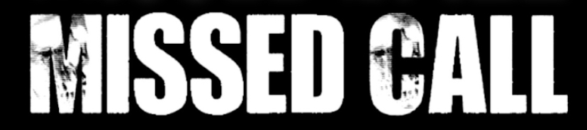
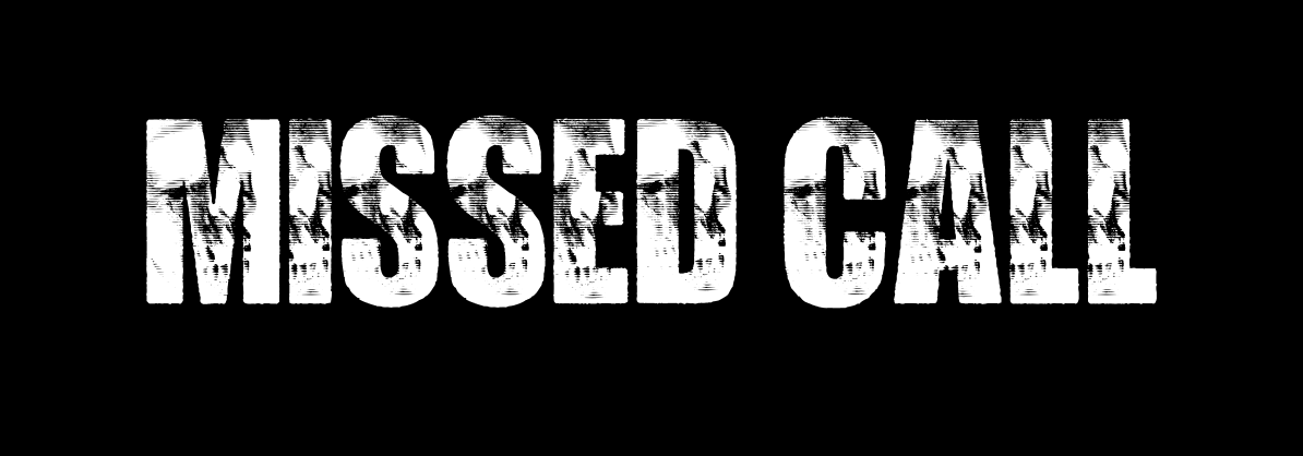
This font is bold, with a subtle texture of “duct tape” almost. This makes the danger feel more direct and
terrifying. The duct tape texture alludes to the fact that duct tape is a common tool for tying victims up,
which could be the daughter in the thriller, even if duct tape wasn’t explicitly shown. The edges are also
not clean and sharp, having some jagged edges, though not obvious. This suggests that some violence is
involved, or that something happened that caused damage. This suits our thriller as our protagonist was
kidnapped, and pulled away with force while she's unconscious just before we plan to show the title.
This font suggests a more physical thriller movie, perhaps implying that the rest of our film is about the
daughter facing and escaping her kidnapping, rather than the mom trying to find her. This type of font
works well with thrillers with dark secrets and mysteries, and the main mystery that arises in our
opening is: why did they kidnap her? What's the motive? how will the mother find her or how will she
escape?
However, I’ve found one problem with this font. With a white background and black test, the duct tape
effect seems clear and cool, however we plan to show the title when the screen is black, meaning the text
must be white.
As you can see, the duct tape effect is not as obvious here, however I think the texture still adds some
mystery to our title, and adds a special touch. Without the texture, I think the font would be too generic.
So for me, it’s not a huge deal.
———
Finally, we decided to use this second font with the bold lettering because it aligns more with our film.
I (Cassie) experimented with the font, size, color and texture. I noticed that most thriller films used
red accents or entirely red typefaces, So I tried it out for our title.
While the red implies violence/blood and connotes danger, the combination of black and red makes
this look like a horror film rather than a thriller. Using a darker red suits our opening more, as dark
red connotes rage or wrath, while a brighter red could represent love. However, the dark red text
is hard to read against the black background.
———
If we kept it white like this, we fear it would be too generic and bland. Plus, it does not really
have a lot of meaning relating to our film opening.
———

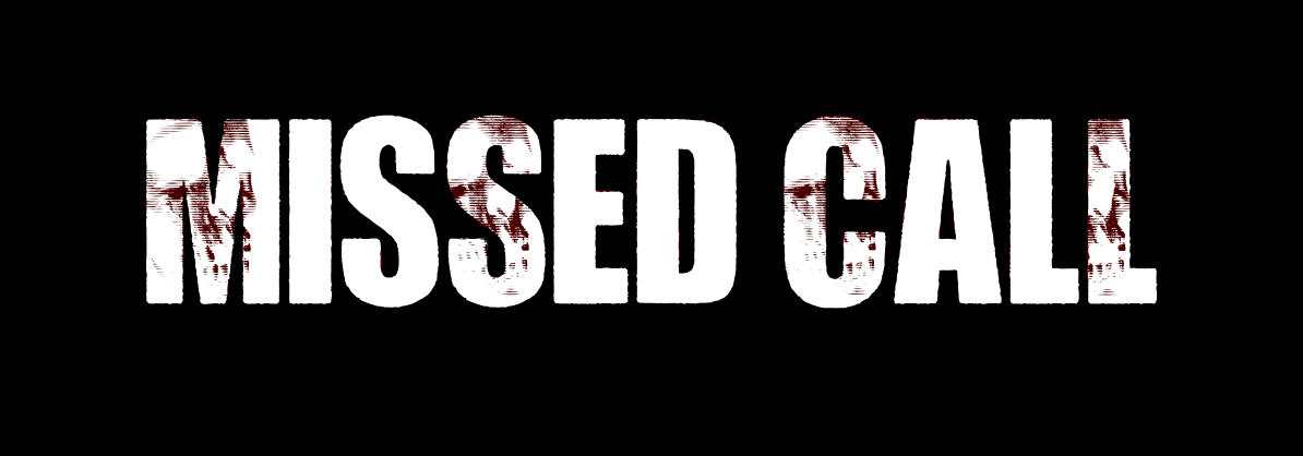
Adding red accents in the textured areas made our title look “bloody”, which fits well with our
kidnapping theme in the movie opening. This also may be a hermeneutic code: How is blood
involved in the next scenes? Did the kidnapper hurt the protagonist? Additionally, the texture
on every letter looks repetitive, as we have double letters with identical textures next to each
other.
———
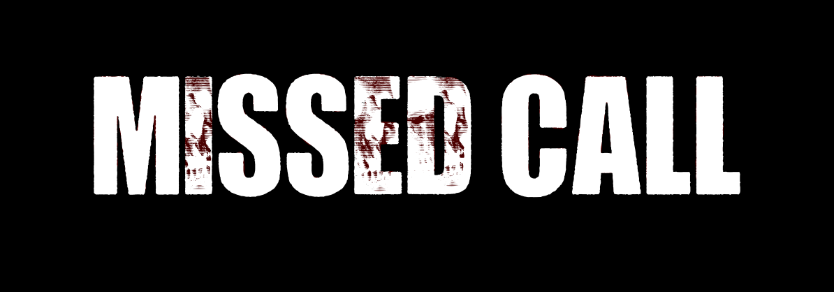
If we add the texture on only a few letters and spread it out, it looks less busy and more cohesive.
However, this brings focus to the letters with the texture. In this title, the letters M, S, C and L
have no significance.
———

Here, the letters I, D, A and L are highlighted. When rearranged, this spells out “DIAL” as in
dialing a number, which is related to the title itself. It also shows its significance in the story.
The texture is also spread out between letters, making the typeface
———
This is similar to the previous one, however, the letters I, E, D are highlighted instead. When
rearranged, this spells out “DIE”, which gives this title a spooky double meaning or perhaps
foreshadowing, meaning it isn’t supposed to be deciphered at first glance. However, there's an
imbalance as the left side of the design is busier than the right.
———
For our final choice, we held a poll in our group chat for the last 3 options. Finally, we decided
on this one.
———
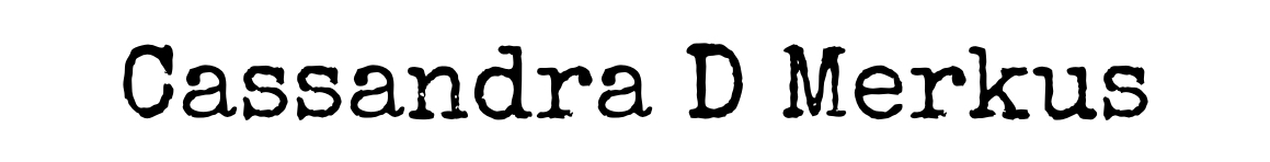
But wait! The title isn’t the only thing we need to make for our typeface. The credits also matter.
We’re going to include the actual name of our actors in the credits, such as: Cassandra D Merkus,
Kimora C Hartawan, Eileen Milano, Charlyn K Wijaya and Tara C Hartana.
In thriller films, even the credits help build tension. The fonts used can make the audience feel
uneasy, excited, or curious. So, I watched the opening credits for a few thriller films and noticed
a pattern.
Here, I looked at movies like Get Out, The Silence of The Lambs, and Zodiac. They all had very
simple fonts which showed it was cold, serious and mysterious. So, I picked similar fonts and
put them all together again to compare.
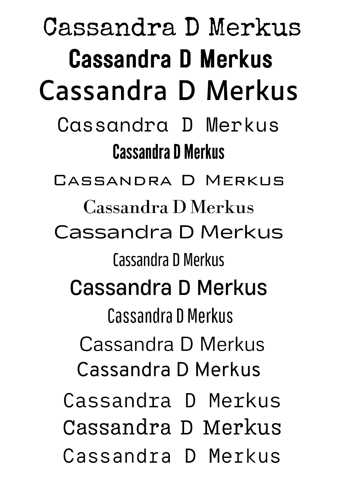
After another poll, we narrowed it down to the first and the last one.
This font has a rough and vintage feel, often associated with mystery, secrecy, and unease.
It is similar with typewritten text from old documents, crime reports or classified files, making
it a great choice for thriller films, especially ones involving investigations or detective work.
This means this might work well with our thriller as our protagonist gets kidnapped, making
her a victim of a terrible crime.
This font is clean and neutral, often linked to technology as it looks typed out. Its simplicity
gives off a calculated vibe, which could work well for a thriller with a "mastermind". Since it
feels controlled, it can be unsettling. It also looks like a text message, which could show the
mothers efforts at contacting her daughter.
——
In the end, we decided to go for the 1st font, as the typewriter gives off a mysterious feel and
the rough edges suggest something bad is happening, making the audience curious.
Colour wise, we are going to keep it simple by keeping the text white to draw focus to the getting
ready scene as it builds the protagonists character, rather than to the actual text.
And with that, we are done with the typeface development :)
No comments:
Post a Comment